Text from the Article by Charles Cramer
A condensed version was used in the magazine....here's the complete version.
Turning to Photography
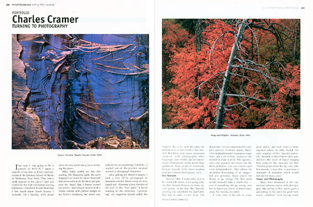
I was sure I was going to be a pianist. In 1974-76, I spent a majority of my time in dreary practice-rooms at the Eastman School of Music in Rochester, New York. This was a stark contrast to the place I had just visited for the first time before leaving California---Yosemite! It was there that I first heard about Ansel Adams. I instantly felt a kinship with Ansel since he also spent many years studying the piano. What really sealed my fate was reading “The Eloquent Light”, the early biography of Ansel by Nancy Newhall. She wrote with such devotion and passion for Ansel that I found myself entranced. I had played around with a 35mm camera and printed images in my father’s darkroom, but never considered this as something I could do... I wanted out of the practice room---I wanted to photograph Yosemite! After getting my Master’s Degree, I took a year off to photograph in Yosemite and the Sierra using my new (used) 4x5 . I became a true disciple in the cult of the “fine print”. I loved working in the darkroom, “performing” my negatives (Ansel called the negative the score, and the print the performance of that score). I also realized that there were many musicians involved with photography---Paul Caponigro, Don Worth, and of course, Ansel Adams. Photography seems much more egalitarian than music---I eventually became friends with these masters (and have played their pianos, too!)
Dye Transfer
Around 1980, I made what was to be a fateful decision---I was going to try the Dye Transfer Process to make my color prints. At the time, Dye Transfer printing was considered the absolutely best way to make a color print. The downside---it’s an extraordinarily complex process. Contrast masks, three-color highlight masks, separation negatives, and a set of film “matricies” are needed to make a print. And since you basically separate the colors out into the three primaries, you can control each color independently. All these steps allow for incredible fine-tuning of an image---but also provide many places for things to go wrong! The first print would normally take a whole day---and if something did go wrong, you had to figure out where in those many steps the mistake occurred. It took years to be able to make good prints, and even more to make superior prints---but only if everything went right (I would describe my feelings about Dye Transfer as “love/hate”). In 1994, Kodak, the only supplier of Dye Transfer materials, decided to discontinue their production---the onset of digital imaging had reduced the demand for Dye Transfer prints from the big color labs. Fortunately, I was able to purchase a stockpile of materials which would last me for many years.
Grain and pixels
I taught Dye Transfer printing for the Ansel Adams Gallery Workshops in the early 90’s, and one of the students there was Bill Atkinson, a member of the original Apple Macintosh design team, and a pioneer in graphics software. Atkinson felt that, although Dye Transfer prints were beautiful, doing all those steps without any feedback was...crazy! Bill went on to become a pioneer in digital fine printing, and would keep me informed of the latest developments. In 1997, with the invention of the Lightjet digital enlarger, we realized that here was a way to create prints that could actually rival a Dye Transfer. Bill kindly mentored me in this new way of accomplishing the things I did in the darkroom. Since my stockpile of Dye Transfer materials was dwindling, the timing was fortuitous.
Combining the two
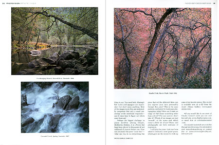
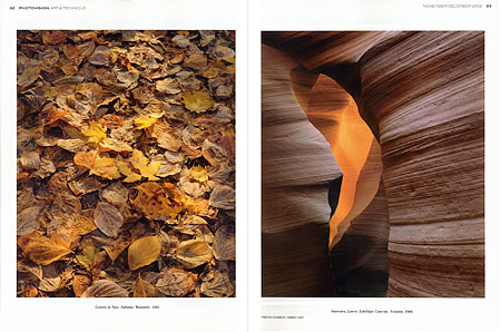
Although I do most of my fine prints now with the Lightjet, I’ve been able to combine the best of both techniques into what I call "digital Dye Transfers". The only difference between the traditional Dye Transfer and these new prints are the separation negatives. After careful experimentation, and creating a "color profile" for my Dye Transfer setup, I can produce full-size separation negatives made on an Agfa imagesetter. These negatives also incorporate all of the work previously done by the various contrast and highlight masks. These negatives are contact printed onto Dye Transfer matrix film, and the matricies are dyed and transferred in register to a special paper, akin to silk-screen printing. This is an expensive and time-consuming process, but has produced the best Dye Transfers I’ve ever made. Not every image benefits from this special treatment---only those with very saturated colors or extensive shadow areas that will show off the extended density range that Dye Transfer offers. In this PhotoVision portfolio, you will see several of the images I’ve done as “digital Dye Transfers”, and some done the traditional Dye Transfer way. Of course, even the best reproductions can only suggest what the original print is like.
Music and Photography
Many have wondered at the connection between music and photography. My feeling is that music gives a grounding in the need for good technique combined with having something to say. You need both. Blazingly fast scales and arpeggios are impressive---but don’t mean anything. Most of the images in my files are technically competent---but only a small percentage evoke emotional responses---and it takes time to figure out which ones those are! To perform a piano piece really well involves hard work, and also some fallow time---for the piece to “ripen” in your subconscious. Since most landscape photographs have to be made quickly (before that fantastic light changes), then what needs to be considered over time is the editing of one’s work. Determining what’s really good, and what’s just “so-so” is the big question. The same goes for deciding on the best way to print an image. Perhaps the biggest challenge in piano involves playing Chopin, Beethoven, Brahms, et al... Pieces that have been played by thousands (if not millions) of pianists before you. How can you make this piece “your own”---what can you do in interpreting this piece that will be different? How can you express your own personality through this piece? This is the same problem confronted by landscape photographers today! How can I make an image of Half Dome something other than a cliché? (The easy answer---don’t take it!) Which of my images are just “records” of the scene---and which reveal a little bit of me? Music and photography are both mediums of expression. I still play the piano every now and again. Last year I was asked to dedicate a new grand piano, which gave me the excuse to work up some of my favorite pieces. This recital is available now as a CD from the Ansel Adams Gallery (www.anseladams.com). [Note: Not anymore! It didn't sell!]
Images used in the article:


