
Making a Dye Transfer Print
When I started making color prints in the late 70s, things were fairly primitive, but there was one process with a mythical reputation that offered tremendous control—dye transfer. I had no idea how all-consuming making dye transfer prints would be! To create one print required the precise exposure and development of approximately twelve sheets of film. The colors are literally disassembled into B&W, and then reassembled in a process akin to silk-screening. With all the steps involved, it offered tremendous control—but also the possibility for things to go terribly wrong. I labored mightily for more than fifteen years with dye transfer. When all the planets aligned, a beautiful print could emerge. But you didn't know how it would look until the final step of "rolling" out a print. I started making dye transfer prints in 1981.
In 1994, Kodak, the only supplier of dye transfer materials, announced they had ceased production. Any remaining inventory was divided up amongst existing customers. I scraped together as much as I could afford to get a decent stockpile. Although I still have a few supplies left, I have not made a new dye transfer print for many years. I actually see no reason to—since I believe I can create superior prints using current technology.
Dye transfer was one of the first color print processes, invented in the early 1940s. By the time I started in dye transfer, most everyone else had quit. The biggest obstacle was getting good information. There was very little in the literature, and I tried to collect everything I could. There are so many steps to making a print—so many variables— combined with the fact that there's no feedback until you finally make the print, that it's hard to isolate exactly what does what!
In the early 80s, Ctein wrote an excellent series of articles in the old Peterson's Photographic Magazine about how to do dyes, and also how to make some of the needed equipment yourself. These articles made me take the leap into actually trying to make dyes. It was very slow going at first, but I kept at it—I contend Kodak put something in the colored dyes to make it addictive! Before I taught dye transfer printing for the Ansel Adams Gallery Workshops in 1987, I spent an incredibly valuable week with an old hand at dye printing, the late Bob Pace. Bob had a fantastic system that allowed one to compute the desired contrast ranges of all the steps involved. Bob also taught me the importance of making not one—but three separate highlight masks with Kodak panchromatic lith film. This makes a huge difference!
I met Jeff Francis, a dentist from Southern California, a few years later, when he came to show me some of his dye transfer prints. They were beautiful! Here's a man with a full-time job, a family, and he still found time to make dye transfers. He explained that on Monday nights he made contrast masks, Tuesday night - highlight masks, Wednesday - separation negatives, etc. By the end of the week, he had finished one print. I learned alot from Jeff, as he is a very clever individual, and now, a good friend.
Another person who I met just as I was winding down my production of dyes was Ed Evans. Ed ran the biggest dye lab in New York City (Evans & Peterson), and knew basically everything about the process. If only I had met him earlier! Ed knew all the tricks... Thanks to these people for sharing their information with me.
Below, I would like to describe part of what was involved in making a dye transfer print. (For those who think they are currently suffering in making inkjet prints, read on! (This makes me feel like the parent telling his kid, "Well, when I was young, I had to walk ten miles to get to school...through snow")!
One question everyone asks, with so many different sheets of film—how do you keep things in register? Actually, with the right equipment, registration is the least of your worries! Here's two of my film punches, and the register frame. The orginal transparency is punched and fit on two diagonally-placed pins in the register frame glass. The masking film is punched, and fit onto the pins behind the transparency, register frame closed, and then exposed under light modified with different sharp-cutting filters (basically Red, Green, and Blue light).
Making the Separations
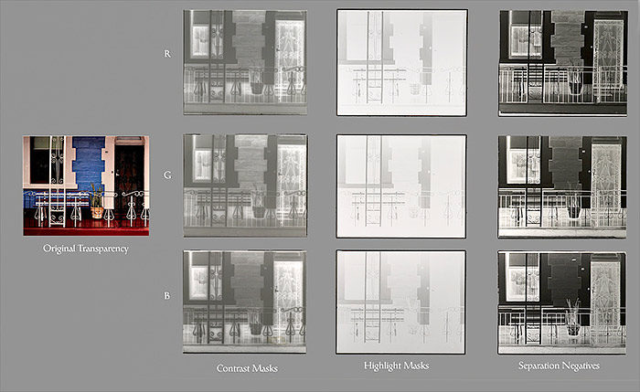
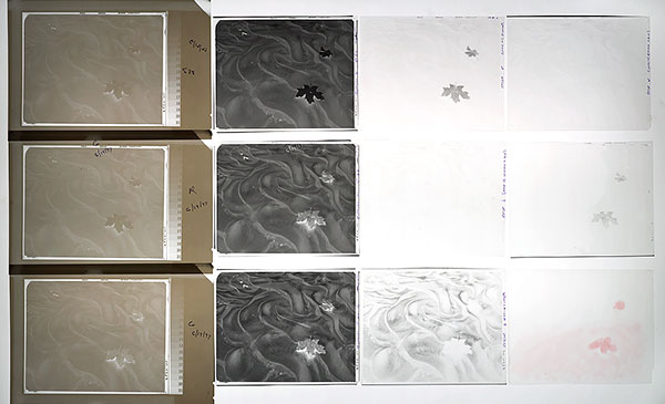
Perhaps the most important part of making a print from a color transparency—and the most mysterious—is the color separation process. Below on the far left, is the original 4x5 transparency, along with the actual sheets of film used to make this small dye transfer print. We're about to "dissasemble" the colors by exposing the transparency to B&W film, using light filtered through red, green and blue filters. The separation negatives are on the far right. But—to make the best separations, you must first reduce the contrast of the transparency (and also do some color corrections for impurities in the printing dyes) by making three contrast-reducing masks, also through various colored filters. Do you notice that the contrast masks (the first row of B&W images on the left) look fuzzy? The film used has no anti-halation backing, which causes flaring. This "unsharp" contrast mask in placed in contact with the orginal transparency when the separation negatives are exposed. The unsharpness of these masks creates an "edge" effect—creating more contrast where light and dark tones meet, thus making the image look sharper. (This is where the "unsharp mask" filter in Photoshop gets its name).
One of the secrets in dye printing concerns the gamma (contrast) of the separation negatives. More contrast equals more color saturation. And to preserve the overall tonal contrast, make the contrast masks stronger when you do this. So everything interacts.
The middle row of light B&W film below are the three panchromatic highlight masks. Since the highlights in the original transparency are a neutral white, they all look about the same. Except—the lowest mask (exposed with the blue filter) shows a little bit of detail in the bright blue wall in the middle! What does this do? That B highlight mask goes on top of the blue separation negative when the yellow printer is exposed, therefore removing a little density from the yellow in that area, making it a more brilliant blue! (did you follow that??)
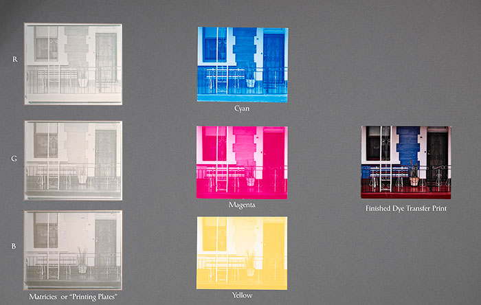
After the contrast masks, highlight masks, and separation negatives are made, you're ready to expose the matrix film—what I call the "printing plates". For my prints, I used matrix film sized anywhere from 11x14 to 20x24. Looking below, I kept the matrices (on the far left below) the same size as the 4x5 original. Three sheets of matrix film (with the three different separation negatives) are carefully exposed, processed, and dried. The matrix (or "mat") exposed with the R separation is placed in the cyan dye, the G in the magenta, and the B in yellow dye. If you rolled each out on a separate piece of receiving paper, you'd get the middle row below. Normally, you would sequentially transfer them onto one sheet of paper, effectively reassembling the image, as you see on the far right.
Whew! And remember, each sheet of film has to be very carefully exposed, developed, and dried. Extensive tests are required to determine the correct exposure and development for each of the colored filters, for each of the films used. Whew, again!
Making a Print
OK—now let's actually make a print! Below are all the masks and separations I created for the sixth time I printed this particular transparency. (When you keep learning new techniques, you have to keep reprinting your images!) This enclosing folder shows some of the calculations used in making the contrast masks and separation negatives, and the resulting densities from a stepwedge, used to determine the effective gamma (contrast) of the films. I designed these separation negatives to have a fairly high gamma of .9, so I could get extended saturation in the red maple leaves.
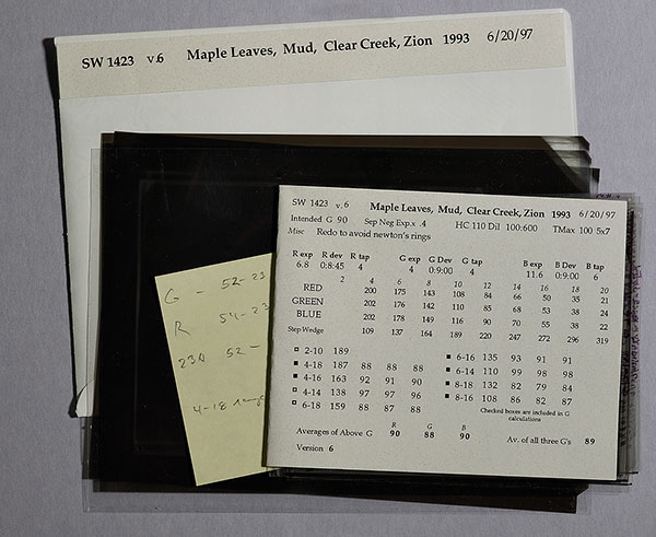
Below are the actual pieces of film I used to make this print. On the far left, the three contrast-reducing masks, then the three separation negatives, then three highlight masks. On the far right are some miscellaneous masks I used during each exposure of all three matricies. These masks do some dodging (the redish mask is "crocein scarlet" for lightening tones), and some extra highlight masks to make the shiny parts of the mud even brighter.
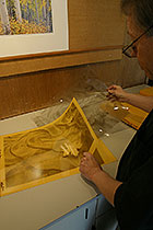
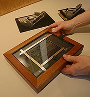
Here's a set of 16x20 mats (printing plates) I made. Fortunately, these can be reused many times to make prints. They are also punched with a much bigger punch, and fit onto pins in the piece of granite I use for a transfer easel. But first, I have to wet them in warm water, and then let them soak in their respective dyes for 5-6 minutes. I have also prepared some of the special dye transfer paper by soaking it for 10 minutes in dye transfer paper conditioner.
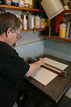
I'm now placing the dye transfer paper into position on the granite transfer easel, and rolling it flat with the big (and heavy) rubber roller.
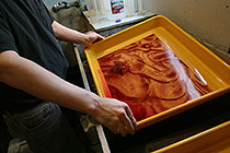
Here's the first rinse for the magenta mat in 1% acetic acid. It will then go into a second holding rinse, also of 1% acetic acid. Various chemical can be added to the first rinse to reduce or increase the amount of dye transfered. That's how you fine-tune the color balance of your print.
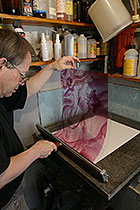
Next, the magenta mat is rolled into contact with the dye transfer paper. "Calgon" can also be added to the first rinse to remove dye from the highlight areas. This can be done on all three mats, or just the colors you want to affect.
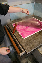
After five minutes, the dye will have migrated out of the mat, and into the paper. Repeat the process for each of the three mats.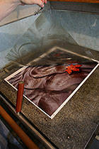
And finally, removing the yellow mat reveals the finished print. There is no washing required, just drying. Many times, air bubbles prevent the complete transfer of dye, so the mats have to be re-rolled onto the paper.
Was that so hard???
Thanks to Karl Kroeber for the six photos of me in the darkroom.